Tuesday, 26 November 2013
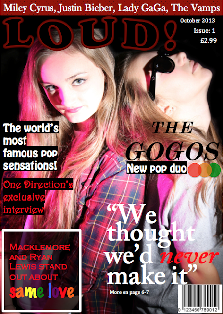
Changes made to front cover next draft
This is my third draft of my front cover, using feedback from my teacher. The first change i made was, changing the shape of the box in the bottom left hand corner giving it a stronger look to the audience. I also changed the font inside the box, making it different to any other font iv used on the front cover which makes the cover look more interesting. I also made the text 'same love' larger, making it stand out as it's the main focus of the article that puff is about. Another change i made was removing the five red circles at the bottom of the page, as i thought it looked better and had a more professional look without them and they weren't needed. I also moved the pull quote further up, as this made it more of a eye level area which means the audience will more than likely be drawn to this text first. I think the brand identity is the red white and black colour scheme, as it will carry on throughout the magazine. Also the choice of fonts and no other magazine will have all of the some font types.
Subscribe to:
Post Comments (Atom)

No comments:
Post a Comment